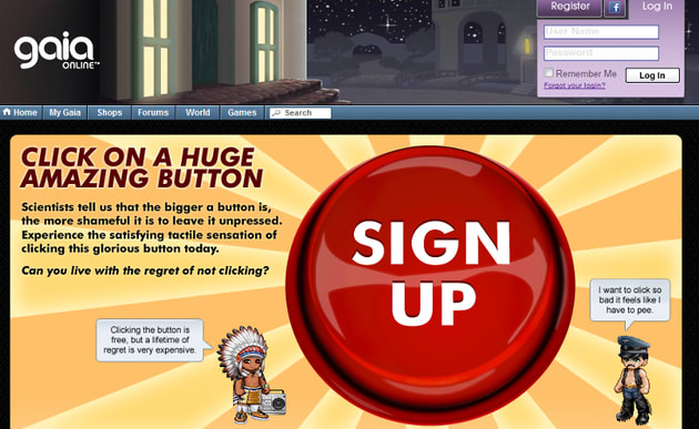
In 2010, Gaia Online started a user acquisition campaign to grow their user base. To simplify the on boarding process, they launched the Big Red Button home page below. It worked. Conversion rates from the home page spiked.
Simple user experiences, like this big red button, are effective because users understand what is expected of them. There is just one flow.
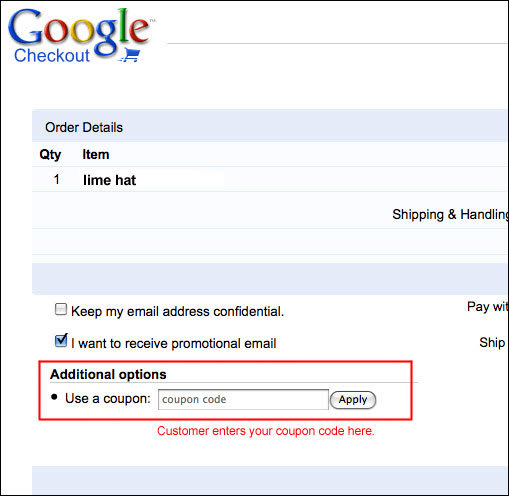
But small features, imperceptible, innocuous features can unexpectedly alter user behavior by adding new flows. The coupon code is a great example of this:
The coupon code is a universal UI element in most check out processes. It seems like a great feature. But as an ecommerce expert pointed out to me yesterday, it’s a huge problem. It is a call-to-action to abandon the current cart - a worst case scenario.
If a customer has a coupon code, the feature works as expected, and the customer enters the code and pays for their basket.
But should a full-price paying consumer stumble across the coupon code, the customer will say to themselves, “Oh, maybe I should find a coupon to get a better deal,” bouncing from the site. Conversion rates plummet.
The coupon code introduces a harmful user flow. And the worst part is the product prods the user to pursue this path.
Every few months, it’s worth evaluating user flows. Even throwaway features, like coupon codes, can have significant impact on user conversion rates, distracting users from the ultimate goal - using your product.

