3 minute read / Sep 27, 2013 /
What Your Startup’s MRR Figure Is Hiding
The three words roll off the tongue: monthly recurring revenue (MRR). What’s not to love about subscription models? Negative working capital, predictable revenue growth and an average of 13x market cap to annual revenue in the public markets, with some darlings reaching 50x multiples. The list goes on.
But the words recurring revenue belies one small detail. These recurring customers must renew their subscriptions, at which point another three word phrase is uttered: revenue-at-risk, the amount of MRR that might be lost to customers who choose not to re-enlist.
Recurring revenue isn’t an iron-clad figure. It’s subject to the rust caused by customer churn. The oft-quoted MRR figure is an optimistic one because it assumes 100% retention rate. Instead, a better metric for MRR might be the expected value of monthly recurring revenue, something along the lines of
eMRR = MRR * (1-churn rate)
The problem with eMRR is that typical SaaS churn rates are small, varying between 1 to 3% per month, so the eMRR doesn’t capture the compounding impact of high churn rates.
Nick Mehta, CEO at Gainsight, showed me another way of visualizing revenue at risk that I’ve replicated in the chart below. Each point is a customer: many customers in the same location darken the dot. The x-axis is the months since a customer subscribed (cohort) and the y-axis is the monthly recurring revenue (MRR).
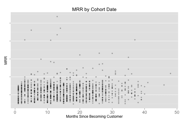
This report shows three different trends:
- How much of revenue is up for renewal assuming 12 month upgrade cycles.
- How the price of the product trends with time and by cohort.
- How sales velocity is changing with time.
I like this report quite a bit, because at a glance, I can get a sense of what’s happening with the business and pull-apart the MRR metric to understand the trends in the customer base and the potential revenue at risk.
Nick’s product adds one more dimension to this chart, and an important one. Gainsight integrates into Salesforce and determines on a per client basis which customers are truly at risk of churning. Instead of assuming quite broadly that all revenue in month 11 is at risk, Gainsight’s report shows you the 10 to 30% or so that truly is at risk. That data isn’t encapsulated in my chart above but is quite useful. But, if a low fidelity model is sufficient, then the R code below might be useful because it produces the chart above.
The Revenue at Risk chart is a fine tool for understanding at a high level the health of the customer base and the sales velocity. It sheds light on the true health of the MRR metric.
R Code
    library(plyr)
    library(ggplot2)
    library(lubridate)

    ### IMPORT DATA ###
    large_accounts <- read.delim("path/to/file")
    large_accounts$date = as.Date(large_accounts$date)
            large_accounts= ddply(large_accounts, .(domain), transform, cmonth = as.numeric(round((date - min(date))/(365.25/12)) + 1, cohort = min(date)))

    ### CALCULATE RAR CHART ###
    vintage = ddply(large_accounts, .(domain), transform, last_month=max(date) )
    vintage_plot = subset(vintage, date==last_month)
    ggplot(vintage_plot) + geom_point(aes(cmonth, mrr),alpha = 0.3) + labs(title= "MRR by Cohort Date", x = "Months Since Becoming Customer", y = "MRR") + theme(panel.grid.major.x = element_blank(), panel.grid.minor.x = element_blank(), plot.title = element_text(size= rel(1.3))) + theme(legend.text = element_text(size = 8), axis.text = element_text(size=14))