When the internet became popular in the 1990s, websites were static & adopted the design language of their creators : blue links & images.
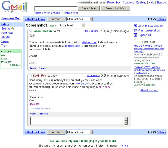
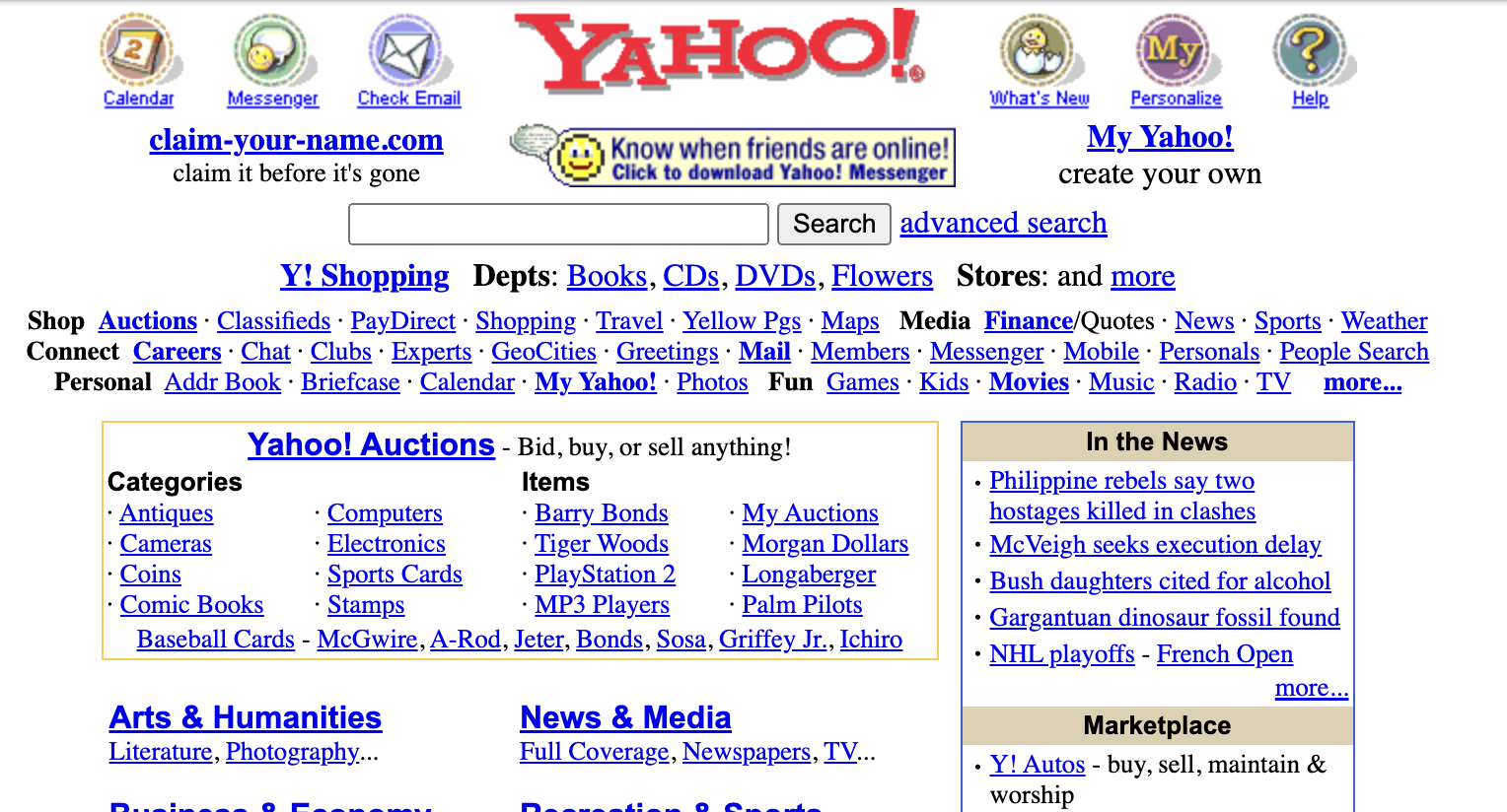 Then, we added interactivity with Javascript. In 2005, Gmail claimed the title of most sophisticated app. Soon there after, Google Maps enabled interactivity in the browser for 2D maps.
 Next, the first mobile apps were launched. FourSquare introduced real-time location, which persists as a feature in Snapchat & Uber
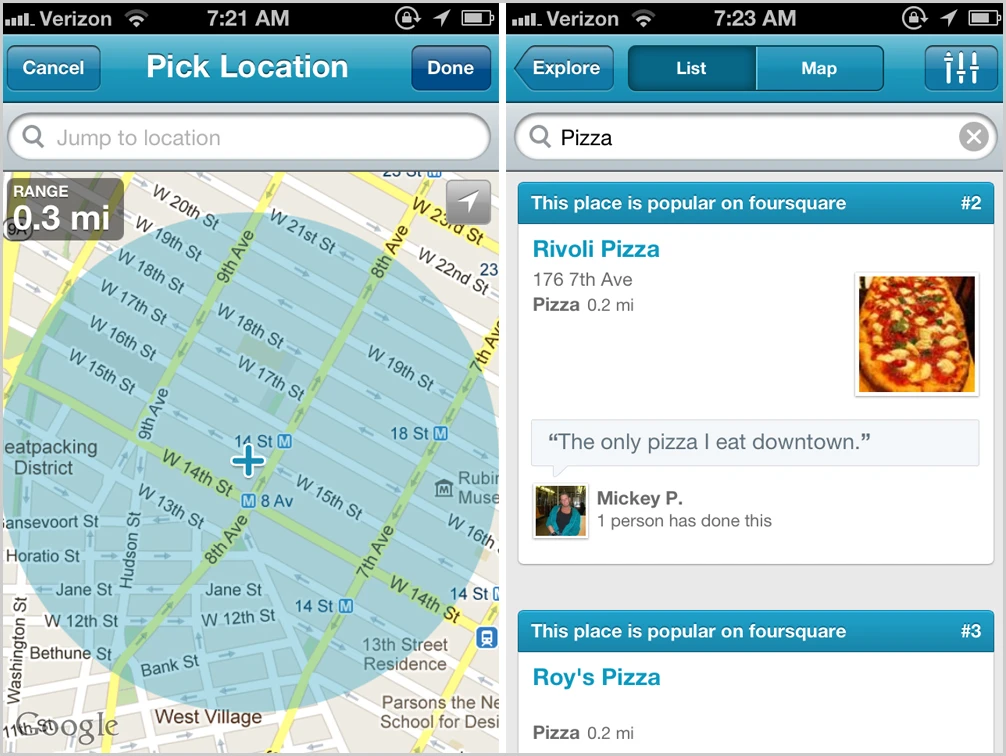 image credit: Fast Company
Google’s Material Design unified Android & web design with blocky, bright colors.

At the same time Apple launched Helvetica Neue with its operating system Yosemite. That design language dominated the fundraising pitch designs of the epoch starting with Apple events : black backgrounds, thin fonts, & smooth transitions.

Six years later, the Single Page App (SPA) became the dominant design pattern bringing smoothness & interactivity in client applications to websites. The SPA was a response to the slow load times of the previous era & created web pages that were typically longer & changed as a person scrolled.
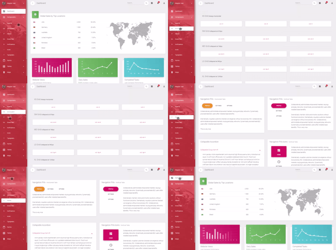
image credit : George Petrov
Current design has perfected the SPA with smooth transitions & a deliberate feeling of progressive reveal.
 Today, state-of-the-art AI design looks like this.
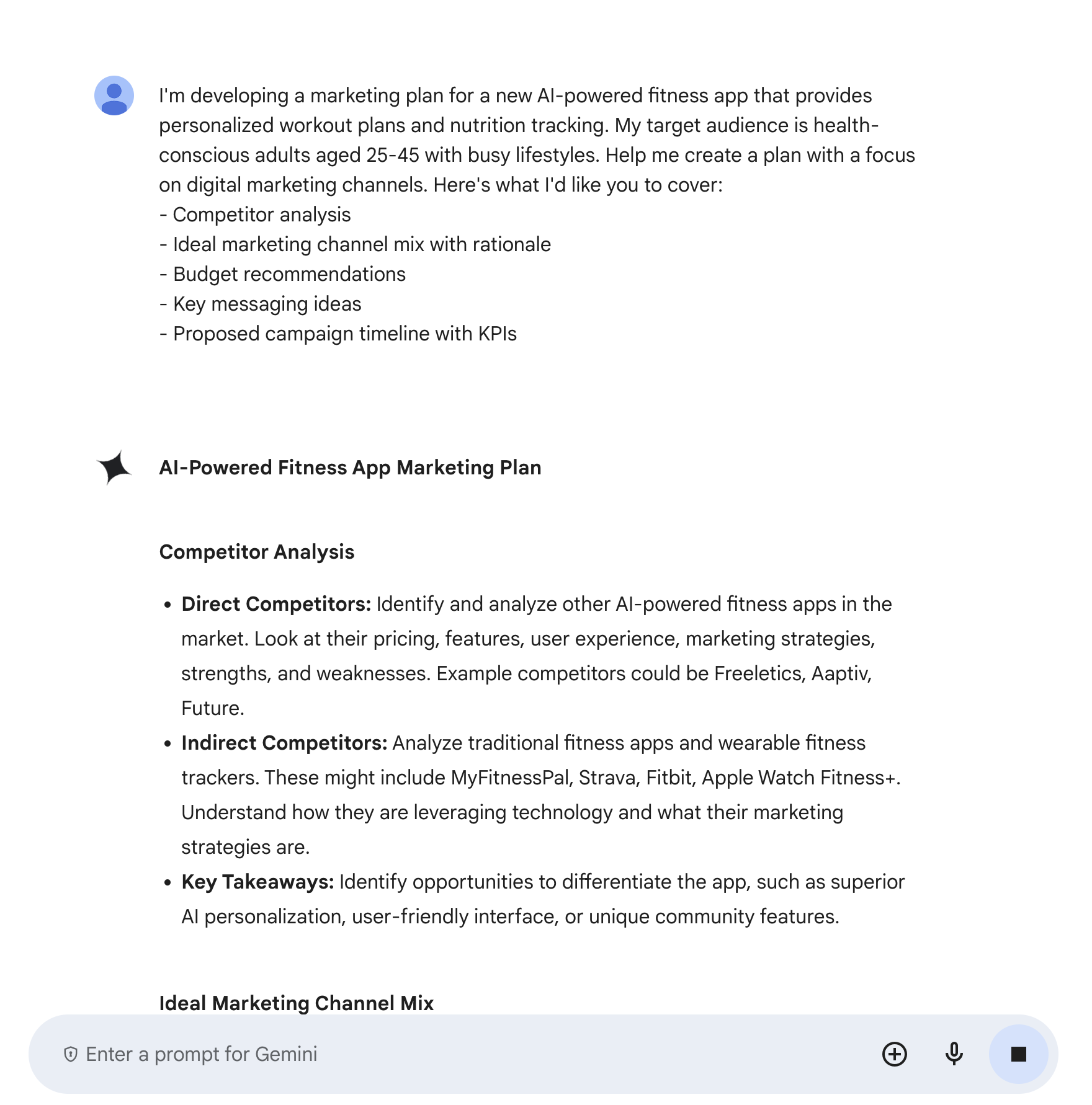
It’s hard not to draw a parallel with the Yahoo page of 1999. What will the next design era look like? The one built for AI?